ggplot2
Ggplot2 is a "system for declaratively creating graphics, based on the grammar of graphics."A
ggplot()
All ggplot2 plots start with a call to ggplot(). You can supply default data and aesthetic mappings (specified by aes()). On top of this different layers, scales, coords and facets can be placed.
geoms
A layer combines data, aesthetic mapping, a geom (geometric object), a stat (statistical transformation) and a position adjustment. Typically a layer will be created with one of the geom_*() functions.
geom_point()
The point geom is used to create scatter plots. It takes the following arguments:
Arguments
- mapping - the set of aesthetic mappings. If not specified the aesthetic is inherited from the top level of the plot.
- data - The data to be displayed in the layer. If NULL, the data is inherited from the top level. A
data.frameor the like object will override the plot data. Or a function can be specified with a single argument: the plot data. - stat - the statistical transformation to use on the data.
- position - position adjustment.
- ... - other arguments passed on to
layer. These are often aesthetics. - na.rm - If FALSE (the default), missing values are removed with a warning.
- show.legend - logical, should this layer be included in the legends?
- inherit.aes - if FALSE, overwrites the default aesthetics instead of combining them.
Aesthetics
- x & y
- alpha - transparency of the points. Useful when there are a number of points to negate overplotting.
- colour - can be used with a categorical variable to colourise the points,
aes(x_var, y_var, colour = c_var). - fill - colour of the inside of the shape, only works on shapes that have a border.
- group -
- stroke - shapes that have a border, this is the width of the border.
- shape - shape to use, there are general shapes from [0, 21].
- Can be used with a discrete variable.
- size - size of the point.
- Can be used with a variable to change the size based on the number.
Examples
Let's a sample of a million parking events data and plot the datetime of arrival versus the duration in seconds:
parking %>%
 sample_n(size = 1000000) %>%
 ggplot +
  geom_point(aes(ArrivalTime, DurationSeconds))

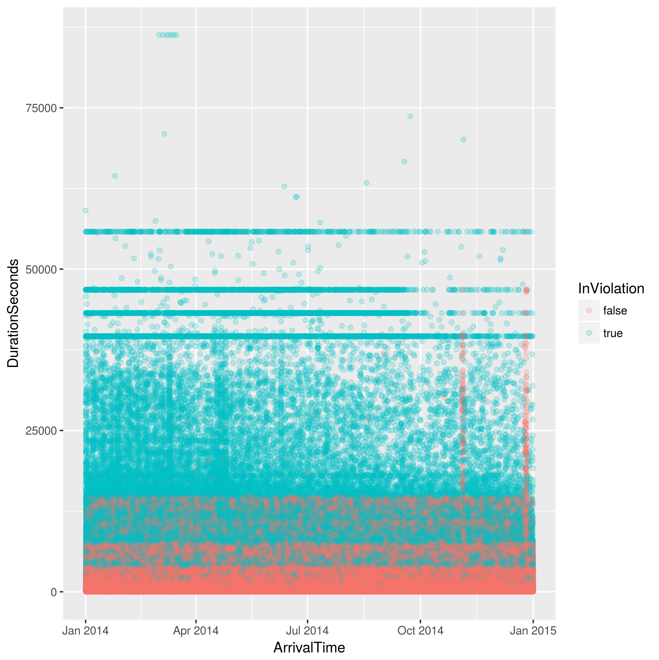
Let's change the colour of the point to be whether the parking event was in violation of the parking sign or not. We'll also change the alpha of the points to make the overlapping points a little clearer.
parking %>%
 sample_n(size = 1000000) %>%
 ggplot +
 geom_point(aes(ArrivalTime, DurationSeconds, colour = InViolation), alpha = 1/5)

geom_bar
The bar geom makes the heigh of the bar proportional to the number of cases in each group. It should be used when the x variable is discrete. If the weight aesthetic is provided then it's the sum of the weights. It uses stat_count by default, counting the number of cases at each x position.
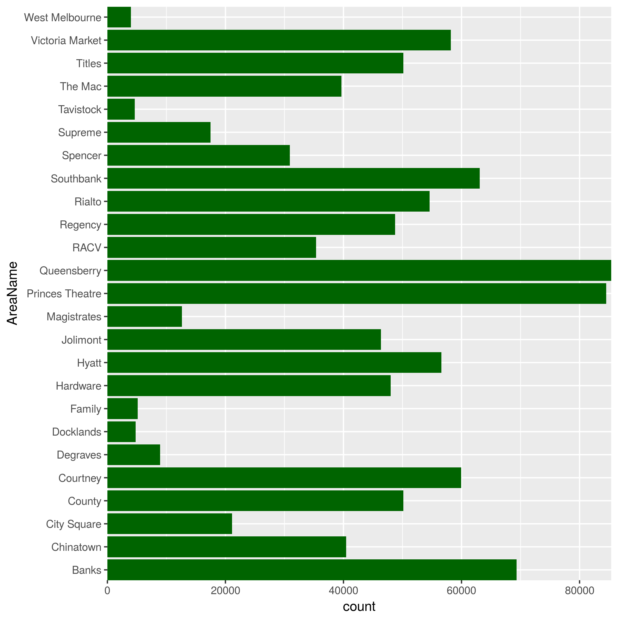
Let's take sample of the parking events data and plot how many parking events each area had. We'll flip the coordinates to make the labels easier to read.
parking %>%
 sample_n(size = 1000000) %>%
 ggplot +
  geom_bar(aes(AreaName)) +
  coord_flip(expand = FALSE)

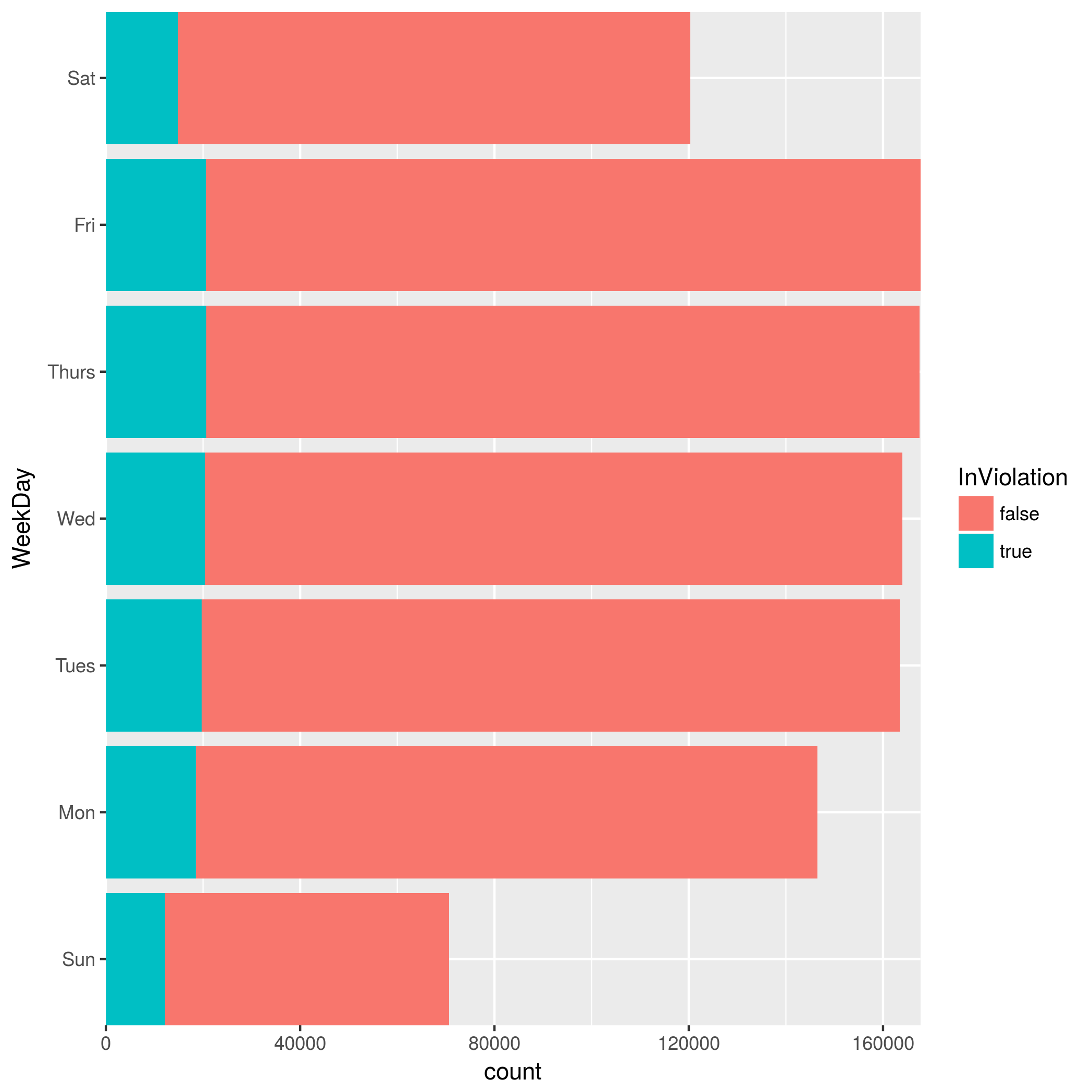
Now let's combine with mutate() in the pipline to visualise how the events are spread out through the week. We'll also change the fill colour to show us how many events are in violation for each day.
parking %>%
 sample_n(size = 1000000) %>%
 mutate(WeekDay = wday(ArrivalTime, label = TRUE))
 %>% ggplot +
  geom_bar(aes(WeekDay, fill = InViolation)) +
  coord_flip(expand = FALSE)

geom_histogram / geom_freqpoly
These geoms are used to visualise the distribution of a single continuous variable. The x axis is divided into bins, and the height of the bar (geom_histogram()) or line (geom_freqpoly()) indicates the number of observations in each bin.
Looking at our example parking data, let's look at the duration distribution. We filter out any durations above two hours, and divide the continuous data into bins of one minute.
parking %>%
 sample_n(size = 1000000) %>%
 filter(DurationSeconds < 7200) %>%
 ggplot() +
  geom_freqpoly(aes(DurationSeconds), binwidth = 60)

We see that most of the durations are very short, with the
Let's take a look at the distribution by the day of the week. We mutate the table, adding a column for the named day of the week. We then add a facet (covered later in this chapter) to split the histogram up by day.
parking %>%
 sample_n(size = 1000000) %>%
 filter(DurationSeconds < 7200) %>%
 mutate(WeekDay = wday(ArrivalTime, label = TRUE)) %>%
 ggplot() +
  geom_freqpoly(aes(DurationSeconds), binwidth = 60) +
  facet_wrap(~WeekDay)

We can note that there is not much change in distribution of durations depending on the day.
Facets
Another method to add variables in to a graph is to use facets. These split the graph up into subplots that each display one subset of the data.
facet_wrap
